12/30/2011
The other day I was surfing around on the internet and noticed two graphs trying to make a political argument by blaming the other party for the sky rocketing debt. As I looked closer, I got really frustrated on how facts can be used so differently. All of this creates so much confusion to the casual on looker unless you are really paying attention. It is difficult to sift through all the information and figure out the truth. I expect most Americans take this information with little or no thought as to what it actually means. Who really has the time figure it all out? I think that is exactly what our politicians and pundits are betting on. They expect, and usually get, an American public that can be easily swayed without giving subjects much real thought.
The following is what I'm talking about:

|

|
The graph on the left was originally published by the New York Times on July 24, 2011 during the Federal Budget Debate this past summer. It was recently re-published by The New Yorker under the title "Five Charts That Explain The Year In Politics".
The graph on the right was created using data compiled by the Office of Management and Budget Historical Table 1.3. It is similar to several I have seen, but I wanted to take the data and format it so it had the same appearance as the graph on the left. Go to the following to see news articles on the subject: Big Government , Obama Set To Request $1.2 Trillion Increase In Debt Limit".
Depending on the political philosophy you lean towards, it is easy to pick out the chart that supports your beliefs. I am not trying to persuade opinions here. The point that I'm trying to get across is that a lot of information you see, read, or hear is generated by a person with motivations not simply to present facts. They usually have an inherent bias whether it is conscience or sub-conscience in nature. (Even as I'm writing this I have a bias, but I am really, really, really trying to be objective!) With that in mind, here are some things you may want to consider when comparing these two graphs and thinking about our growing National Debt:
1) You can think of the Federal Budget in terms of your household budget. The Year End Formula would simply be:
Surplus (or Deficit) = Income minus Expenses
2) The graph on the left only describes the "Expenses" in the formula above. This does not tell the whole story. Again, thinking of the household budget you can easily compare "Expenses" of Tom Cruise with yourself. I'm sure there would be a big difference. Addition of the "Income" information to this graph would be helpful.
3) Any increase in "Expenses", especially if they are established as items that likely won't go away in the future such as the Medicare Drug Benefit or Health Reform and Entitlement Changes, don't help to reduce our national debt. These items become Expenses that must be paid for in the years to come.
4) Federal spending always has unplanned "Expenses" such as war, natural disaster, and economic downturns. Although these can, and usually do, increase our national debt, they are anomalies that hopefully only last for a few years.
5) In the graph on the left Bush tax cuts and Obama tax cuts are considered "Expenses". Isn't this just a reduction in "Income"? Interesting how the same thing can be described so differently. Lets say my employer chose to only give me a 2% raise next year rather than a 6% raise. That would be a 4% reduction in my increase in "Income" and it would be strange to call it a 4% increase in my "Expenses".
6) The graph on the left is describing new spending by Bush and Obama. The Bush graph is based on "Actual" data. The Obama graph is based on 2 years "Actual" and 6 years "Projected" data. The Federal Government is fighting tooth and nail until the midnight hour on budgets for next year, how accurate do you really think "Projections" through 2017 are when back door deals are being made at the last minute?
7) The graph on the right is data compiled by the Office of Management and Budget. The graph is a Year End "Surplus (or Deficit)" after all "Expenses" are subtracted from "Income". This does not tell the whole story either. Addition of "Income" and "Expense" information to this graph would be helpful. During a downturn in the economy the tax revenues are lower resulting in less "Income" for the Federal Government.
8) An increase in the "Deficit" of the Federal Budget results in an increase in our National Debt. The Debt is the year end sum of "Surplus (or "Deficit") going back to the founding of our country. A lot of discussion this past summer during the Federal Budget debate was regarding the amount that the "Deficit" would be reduced. The reduction in the "Deficit" is good, but keep in mind that this just means the National Debt is growing at a smaller rate with the "Deficit" reductions, but the National Debt is still growing until a year end "Deficit" becomes a year end "Surplus".
9) The graph on the right summarizes the "Deficit" for Bush between the years he was president, 2001 - 2008. However, Bush did not sign into law the 2001 Federal Budget, rather this was signed into law by Clinton. Same for the "Deficit" for Obama between 2009 - 2017. Obama did not sign into law the 2009 Federal Budget, rather this was signed into law by Bush.
10) The graph on the right summarizes the "Actual Deficits" while Bush was president. However, it summarizes the "Projected Deficits" for Obama for 6 out of the 8 years. The "Projected Deficit" is equal to the "Projected Income" minus the "Projected Expenses". As I pointed out earlier, the "Projected Expenses" year to year is pretty hard to predict when next year's Federal Budget can't be agreed upon until the absolute last minute. The "Projected Income" is really optimistic. According the Office of Management and Budget Historical Table 1.3, the "Projected Income" of the United States is to predicted grow as follows:
2011 = 0.5% Increase In Federal Revenue Over 2010
2012 = 20.9% Increase In Federal Revenue Over 2011
2013 = 14.3% Increase In Federal Revenue Over 2012
2014 = 11.0% Increase In Federal Revenue Over 2013
2015 = 7.5% Increase In Federal Revenue Over 2014
2016 = 6.6% Increase In Federal Revenue Over 2015
The highest increase in Federal Revenue over the past 20 years is 15.9% (1981). The average increase during those years is 5.1%.
11) Another way to look at debt would be the same way a bank looks at you when they want to determine how much house you can afford. A bank will consider all of your personal debt and keep the total under a percent of your total income. If you look at the Federal Debt in this manner you can graph it as follows:
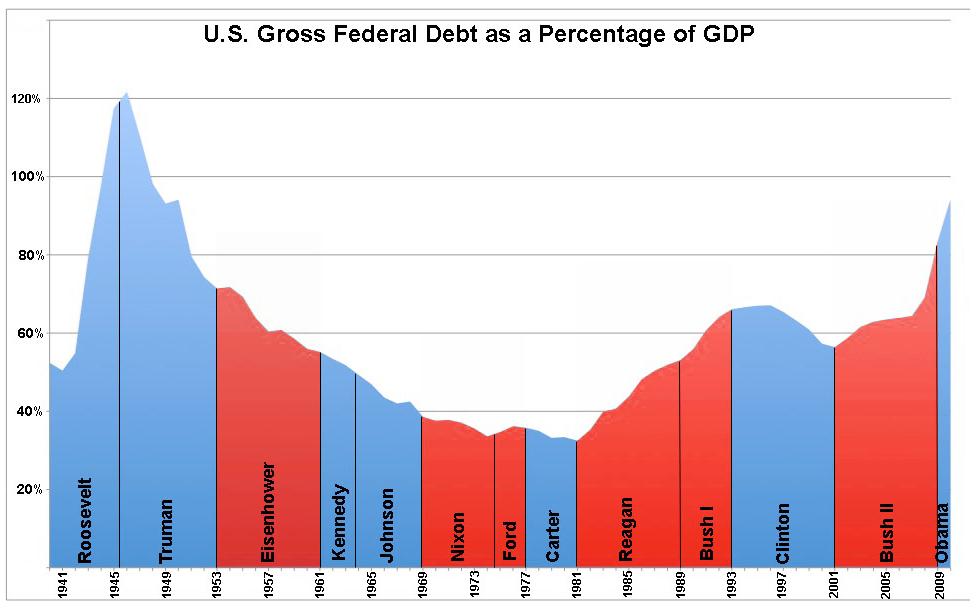
12) Looking at the Federal Debt as a % of the GDP it accounts for "Expenses" and "Income" differences over the years. Looking at the data in this manner shows that "Expenses" as a percentage of GDP sky rocketed during World War II and then gradually dropped for several decades, reaching a low at the end of the Carter years. After that, it only dropped again during the Clinton years.
13) The graph above provides a better picture of the National Debt. However, what is rarely stated in the media is that all the President does is sign a bill into law. The President can suggest what should be in a bill and provide leadership in setting agendas. Per Article I of the the United States Constitution, "The Congress shall have power to lay and collect taxes, duties, imposts and excises, to pay the debts and provide for the common defense and general welfare of the United States". All spending is driven by Congress, NOT by the President. So a better graph would also include who was in charge of Congress during each year that was outlined above.
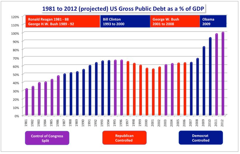
14) The graph above now shows that the National Debt increased when Congress was Democrat and generally dropped or leveled off when Congress was Republican controlled regardless of which party was in control of the Presidency. Again, this is just another way to argue the same thing just looking at it in another way.
The Bottom Line
Data can be skewed in a lot a ways to support a position. The difficulty for the casual observer is to sift through all the noise and find the truth. Republican or Democrat, they both have agendas and want to show their party in the best light. Always keep this in mind. Consider the point of views of not just the party or ideology you support but also try to understand what the opposing point of view is saying. The truth may be found somewhere in between. As a final thought, the National Debt is projected to be close to 100% of the GDP by 2012. In 2007 Greece's debt was 105% of thier GDP. In 2010 Greece's debt was a staggering 143% of their GDP. We can not let the United States go down the path of Greece. It will take all Americans, Republican / Democrat / Independents, to get our National Debt under control. If "Income" drops, our "Expenses" must drop. If our "Expenses" increase, our "Income" must increase. Since the Federal Government does not have the disipline to make this happen year to year, the path forward should be a Balanced Budget Amendment.
